


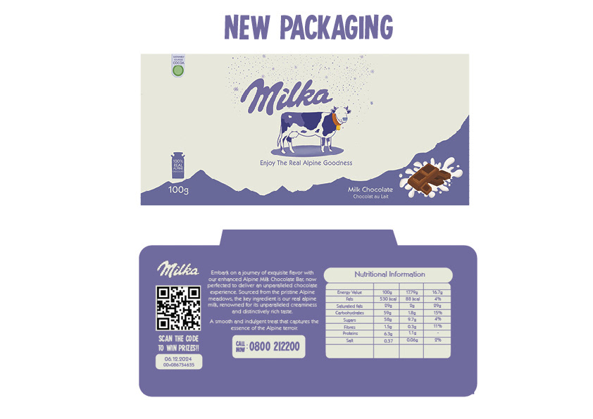


A timeless classic, Milka has maintained a visual identity through the years, adapting to each decade accordingly. However, I felt a rebranding was due, to perhaps open it up to a more contemporary audience that focuses more on aesthetics. By slightly changing the hues of the original white and purple, introducing new typefaces and also using a more illustrative style, this project aims to change Milka just enough to adapt, while also staying recognisable. I kept the known motifs of the logo and cow the same, while also using most of the same taglines, but adding 'Now Better Than Ever Before', to acknowledge the rebrand. Marketing assets include new packaging, Instagram animations, Instagram story posts, a website redesign and posters.


